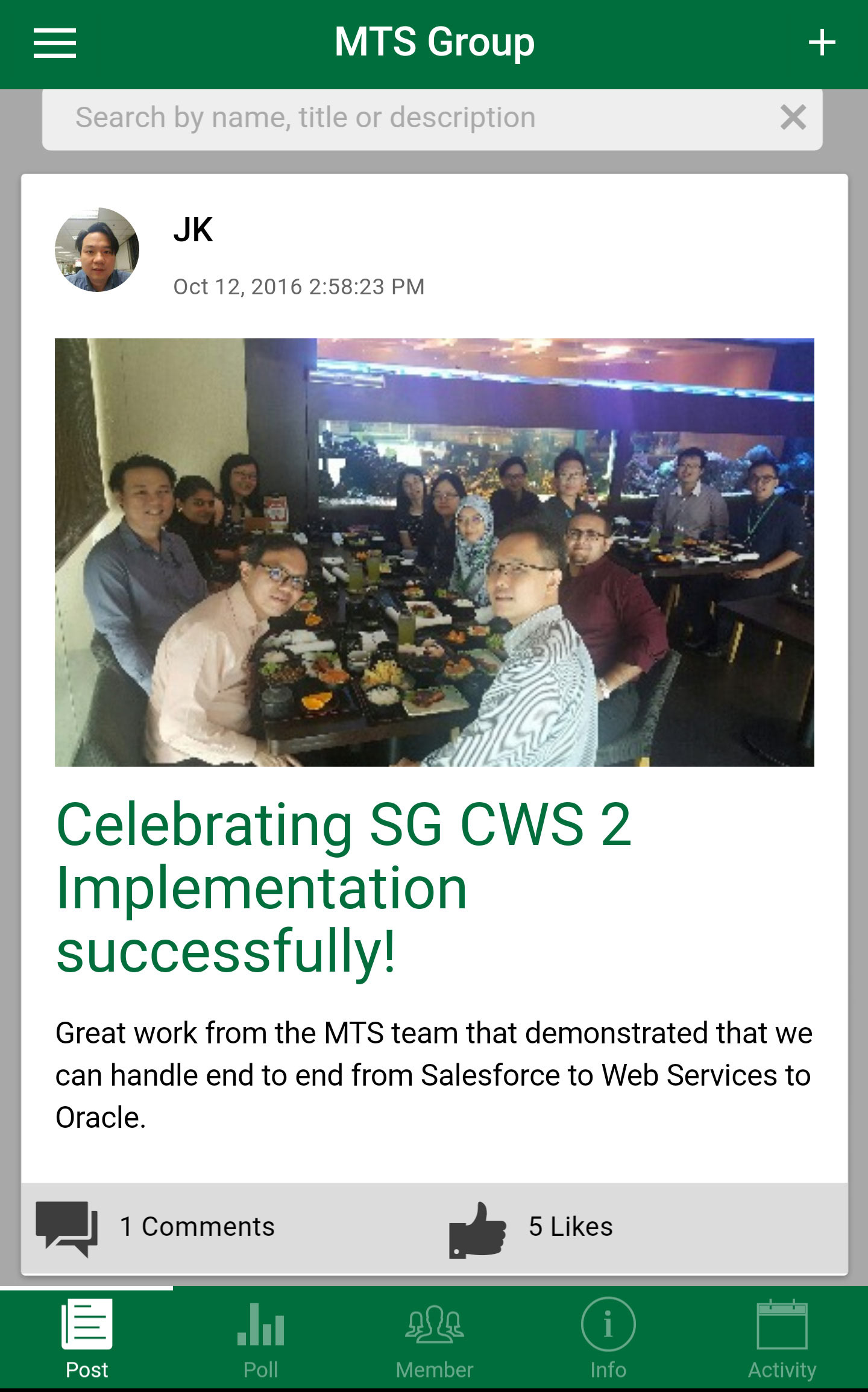
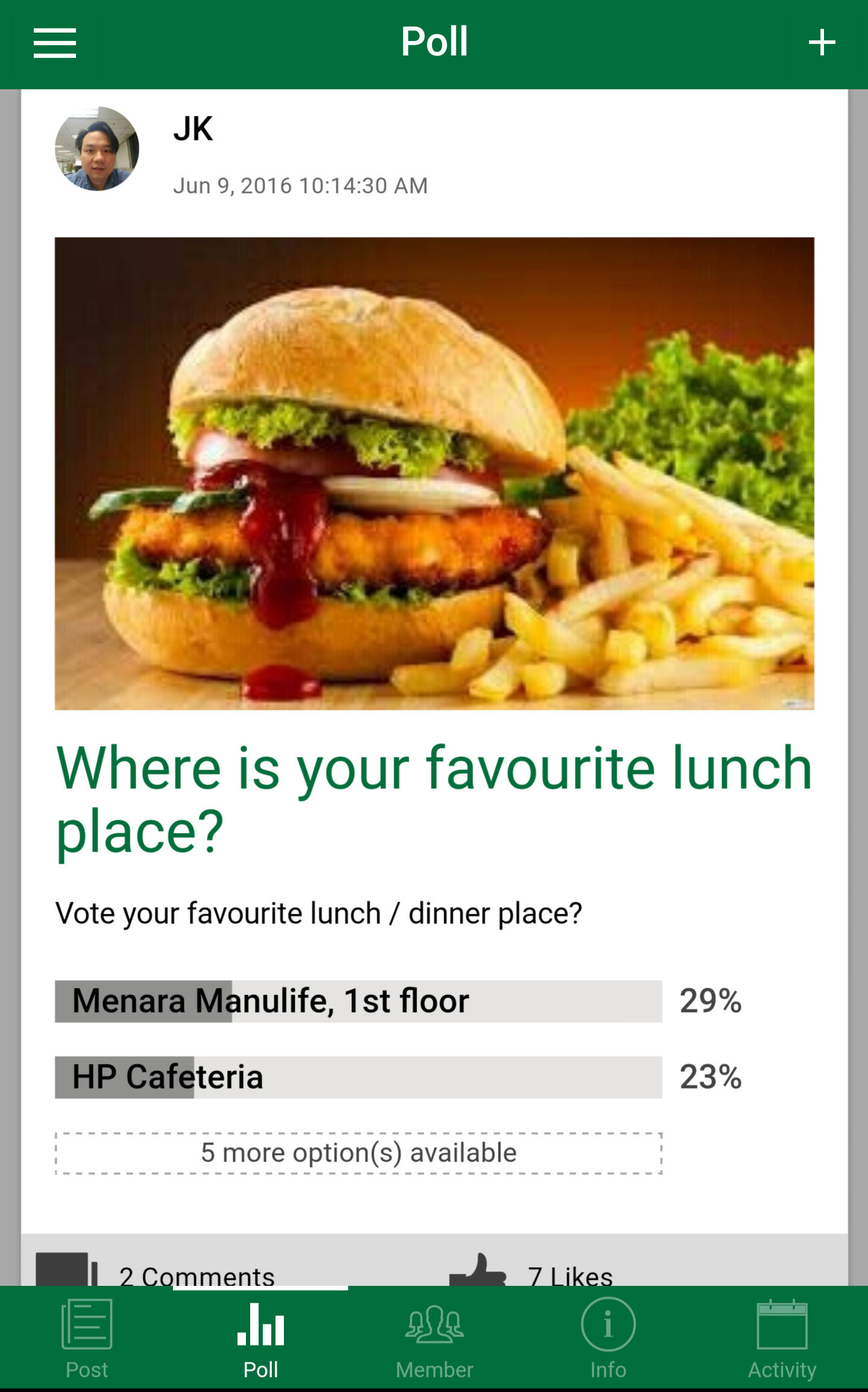
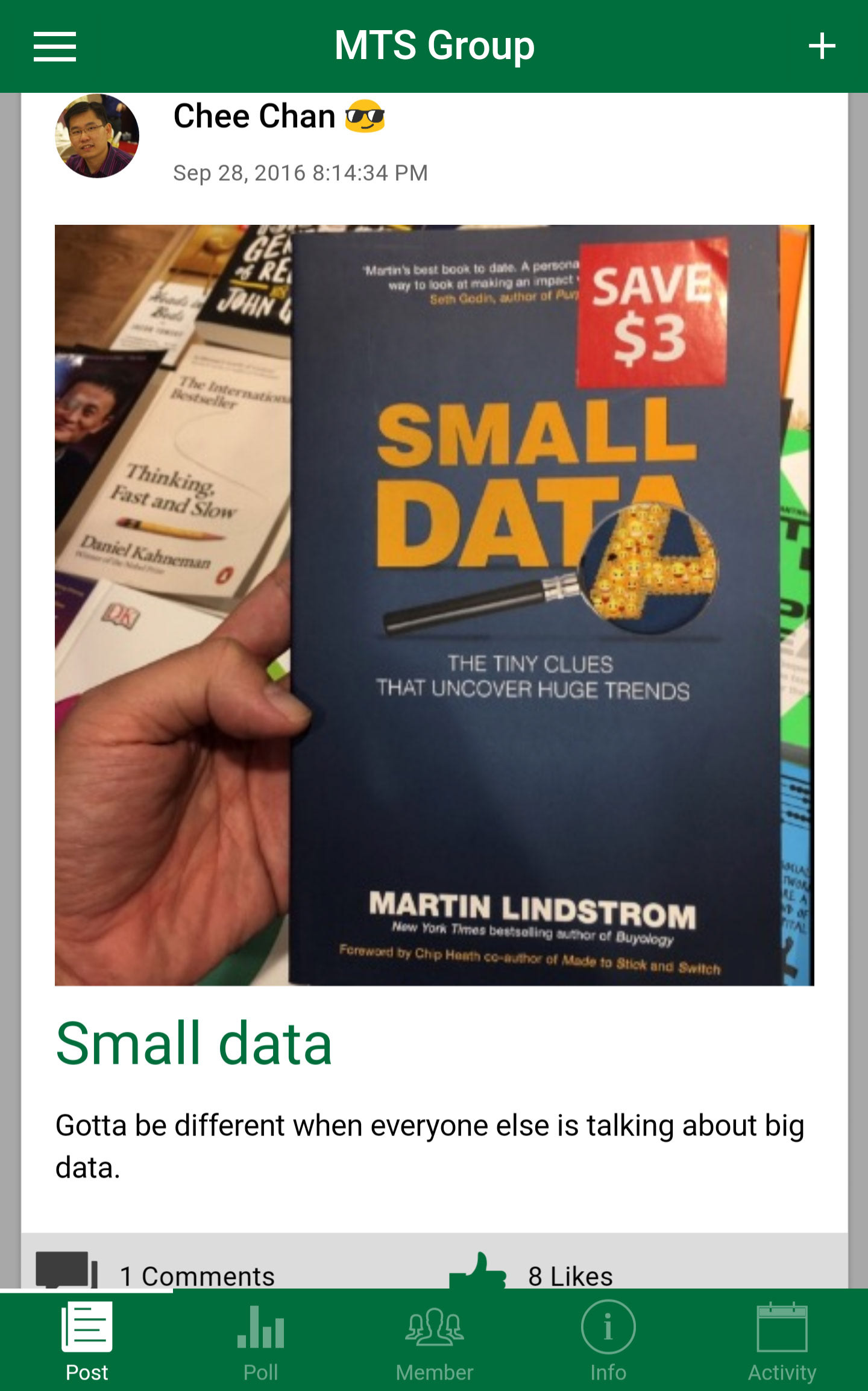
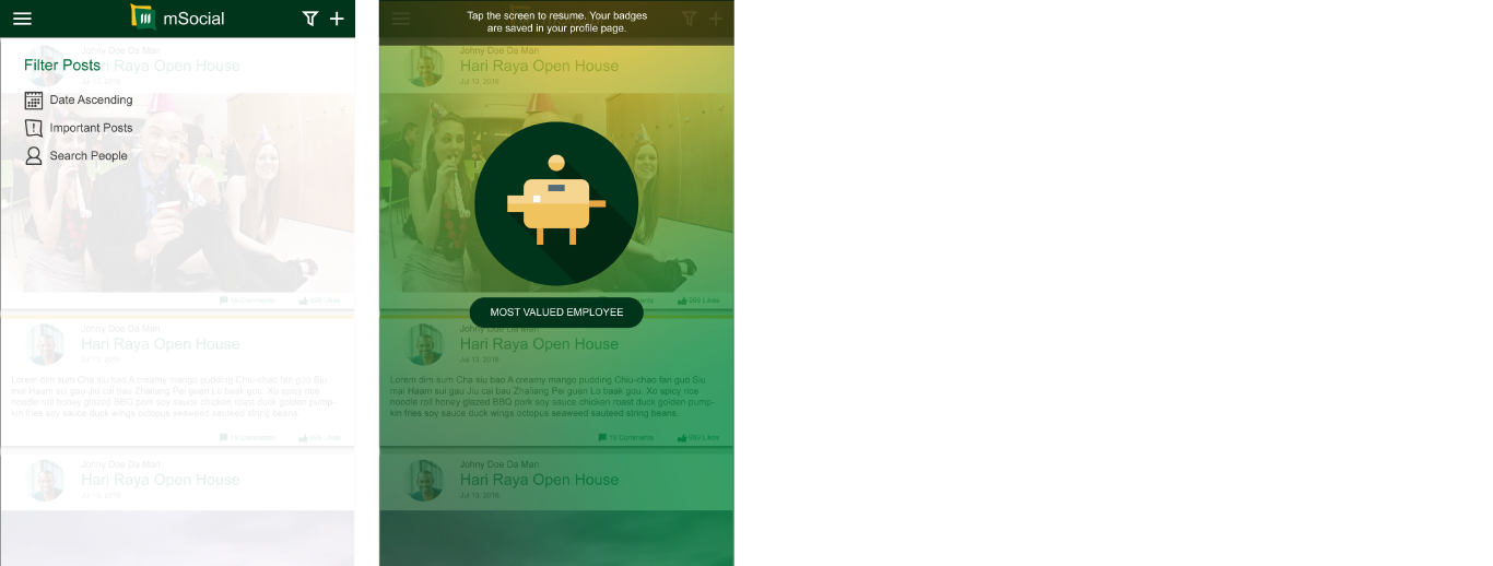
These are the visuals of the original mSocial App.The app started off as a Facebook like application for internal company use.
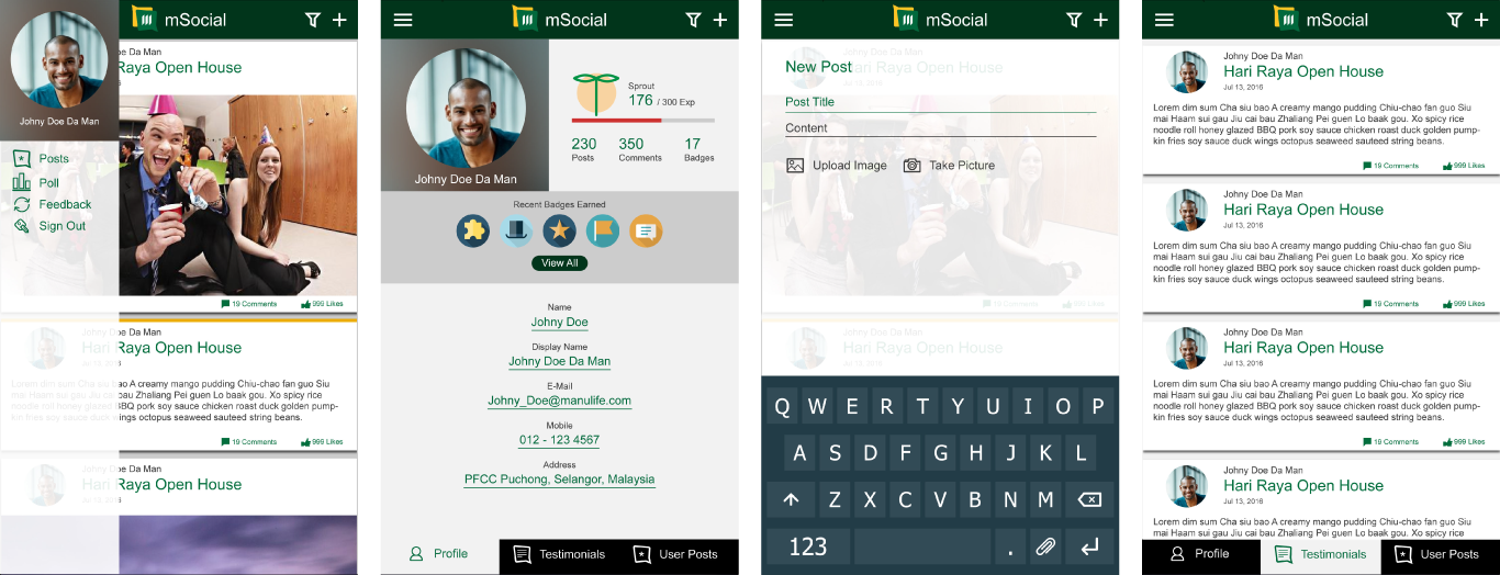
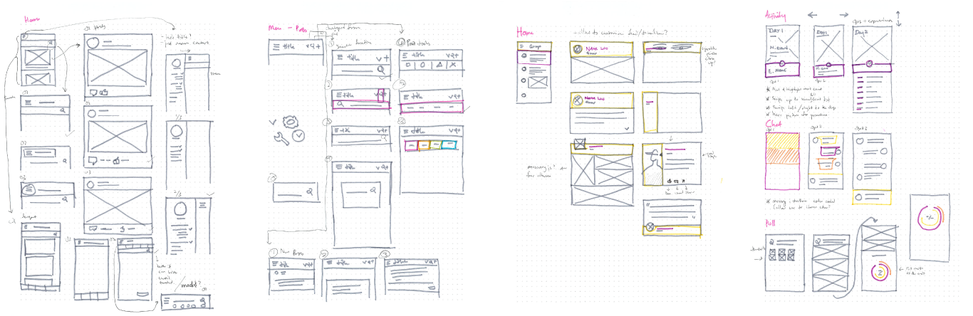
The initial UX redesign was more about creating a new layout to separate it from Facebook. Different menu layouts were tried and tested and tuned according to internal user testing. Gamification features were suggested by the team and a rough mock-up was done as a proof of concept. However the feature was scrapped on the later versions because it would consume too much resources and effort to develop and provide very little gain for the users and business units.
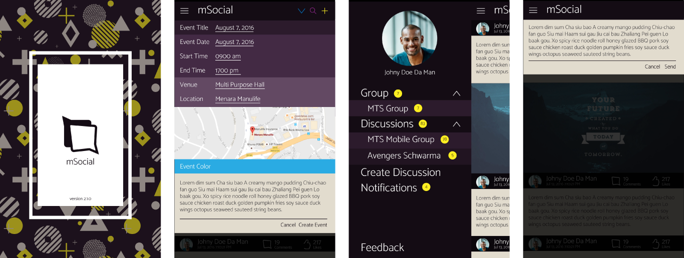
Further user research was conducted to identify pain points, layout preferences and performance. Information gathering with stakeholders were conducted to understand how the application should be positioned and commercialized. At this point, as a result of some of the UX and technical changes to the app in the earlier phase; we begin to see an increase in app usage and user retention (tracked with google analytics). The new goal was to increase app usage further and to try to sell the app to both the business units as well as other companies. Armed with new information and direction; the app UI & UX design underwent another redesign to replace the company branding and colors to be more brand neutral.
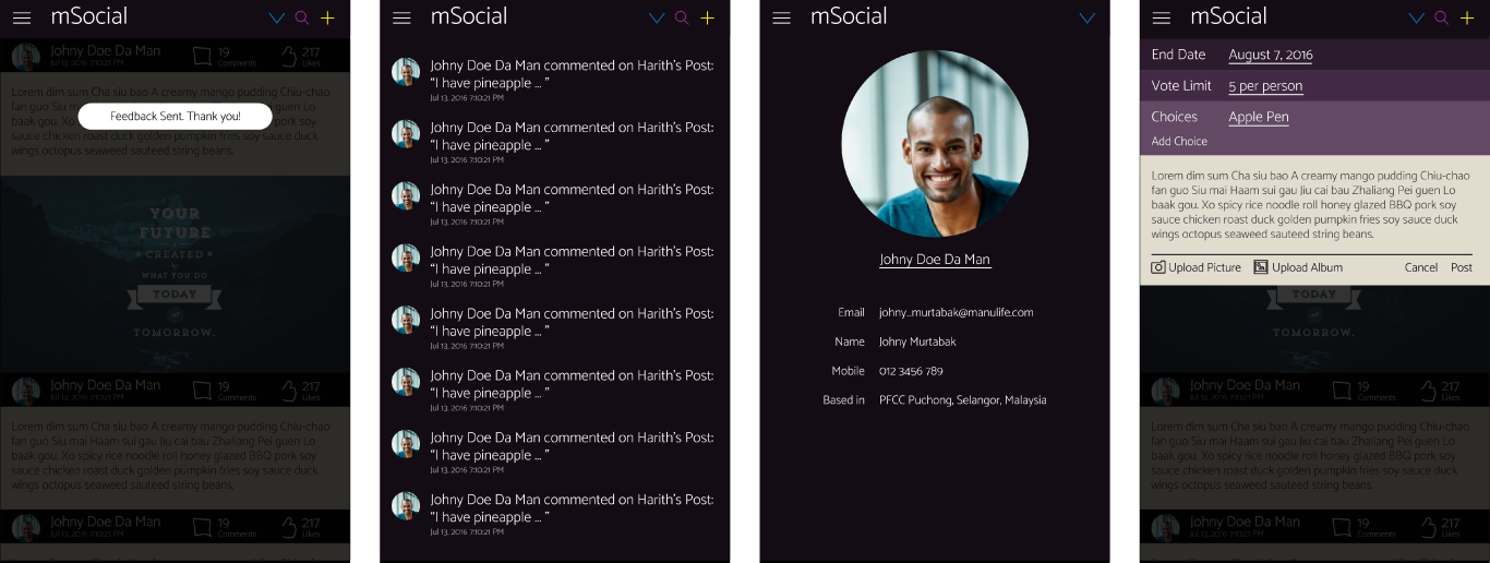
Results: We see another huge increase in user engagement and retention for the app. Users began to share articles and contents within the app. Team discussions took place in the chat rooms hosted by the respective teams rather than unsecured networks like Whatsapp or Facebook. HR made use of the "Create event" function to organize weekly running activities. Some business units that weren't interested in the app as a tool were beginning to express their interest in the app.